Show the code
# Charging dependencies
library(tidyverse)
library(spotifyr)
library(ggridges)
library(RColorBrewer)
library(MetBrewer)
library(plotly)
library(htmltools)
library(ggiraph)March 14, 2024
This is the results of an OECD workshop on R called R4DEV created and taught by Nelson Amaya. It took place from March to June 2024. During this workshop, I learned how to use R for text analysis, data visualisation (plots, animated graphs and maps), web scrapping, shiny apps and quarto publishing.
Let’s first load the packages necessary for the analysis.
I define my token for accessing the Spotify API (hidden) and create the function for retrieving the artist ID.
Then I define some of my favorite artists in a tibble.
Now I retrieve the data using the Spotify API.
Finally here is a graph of the 4 artists.
spotify_covers_gg <- favorites_music %>%
purrr::map_df(bind_rows) %>%
dplyr::left_join(favorites, by="artist_id") |>
dplyr::mutate(cover = map(album_images, ~.x[[2]][[2]])) |>
ggplot(aes(y=energy,x=valence,color=artist_name))+
geom_point_interactive(
aes(shape = artist_name,
tooltip = paste0(
"<div style='display: flex; align-items: center;'>",
"<img src='", cover, "' style='width:100px; height:auto; margin-right: 10px;'>",
"<div>",
"<b>Artist:</b> ", artist_name, "<br>",
"<b>Song:</b> ", track_name, "<br>",
"<b>Album:</b> ", album_name,
"</div>",
"</div>"
)),
position = "jitter")+
geom_hline(yintercept = 0.5)+
geom_vline(xintercept = 0.5)+
annotate("text", x = 0.2, y = 1, label = "Turbulent/Angry")+
annotate("text", x = 0.8, y = 1, label = "Happy/Joyful")+
annotate("text", x = 0.2, y = 0.1, label = "Sad/Depressing")+
annotate("text", x = 0.8, y = 0.1, label = "Chill/Peaceful")+
labs(title = "Energy vs. Valence by artist",
caption = "Source: Spotify data")+
MetBrewer::scale_color_met_d(name = "Ingres")+
scale_shape_manual(values = c(1:8))+
theme_classic()+
theme(legend.position = "top",
legend.title = element_blank())
girafe(ggobj = spotify_covers_gg)Most of the music produced by the four artists I chose is high-energy music. Dooz Kawa musics are rather happy and joyful (not so sure about that…) whereas Twenty One Pilots and Damso musics are more turbulent. Connor Price’s songs are equally distributed between angry and joyful, which seems correct. Also, apparently, I don’t listen to low energy music unless it’s depressing…
Now let’s build a nice graph from OWID data. Let’s focus on CO2 emissions.
I first download the dataset directly from Github.
I then build a nice bubble chart, made interactive with plotly.
p <- co2data |>
filter(year=="2018") |>
dplyr::select(country, population, gdp, co2_per_capita, co2, continent) |>
dplyr::filter(!is.na(continent), !is.na(gdp)) |>
mutate(gdppc=round(gdp/population, 0)) |>
arrange(desc(co2_per_capita)) |>
mutate(country = factor(country, country)) |>
mutate(text = paste("Country: ", country, "\nCO2 per capita (t): ", co2_per_capita, "\nPopulation (M): ", round(population/1000000,2), "\nGdp per capita ($) : ", gdppc, sep="")) |>
ggplot(aes(x=gdppc, y=co2_per_capita, size = population, color = continent, text=text)) +
geom_point(alpha=0.7) +
scale_size(range = c(1, 20), name="CO2 per capita (t)") +
scale_x_log10(breaks = c(1000, 10000, 100000),
labels = c("1 000", "10 000", "100 000"))+
scale_color_viridis(discrete=TRUE, guide=FALSE) +
theme_ipsum() +
theme(legend.position="none")+
labs(title = "Chart of country population size by CO2 emissions and GDP",
x= "Annual GDP ($/per capita, in log)",
y= "CO2 emissions (tons of CO2/per capita")
pp <- ggplotly(p, tooltip="text") |>
layout(annotations =
list(x = 1, y = -0.2,
text = "Source: OWID Data",
showarrow = F,
xref='paper',
yref='paper')
)
ppI must say this graph is pretty useless and it doesn’t show much information, but the keyword to remember here is “pretty”.
Let’s create two side-by-side visualisations using ggiraph. We use the dataset epa2021 from the package openintro.
First we clean and arrange the data.
data(epa2021)
data <- epa2021 |>
mutate(luxury=mfr_name %in% c("Rolls-Royce", "Porsche", "Maserati", "aston martin", "Ferrari", "Lotus", "Jaguar Land Rover L")) |>
mutate(luxury=factor(luxury, levels = c(TRUE, FALSE), labels=c("High-end", "Not high-end"))) |>
group_by(mfr_name) |>
mutate(avg_city_mpg = mean(city_mpg, na.rm=TRUE),
avg_hwy_mpg = mean(hwy_mpg, na.rm=TRUE)) |>
ungroup()Then we create our first plot.
p1 <- data |>
ggplot() +
geom_segment_interactive(aes(x=forcats::fct_reorder2(mfr_name, desc(as.integer((luxury))), avg_city_mpg), xend=mfr_name, y=avg_city_mpg, yend=avg_hwy_mpg, tooltip=luxury, data_id=luxury), color="grey", size=1.3)+
geom_point( aes(x=mfr_name, y=avg_city_mpg), color=rgb(0.2,0.7,0.1,0.5), size=3 ) +
geom_point( aes(x=mfr_name, y=avg_hwy_mpg), color="lightblue", size=3 ) +
coord_flip()+
theme_ipsum() +
theme(
axis.line = element_line(colour = "grey50"),
panel.grid.minor = element_blank(),
panel.grid.major.y = element_line(linetype = "dashed"),
plot.background = element_rect(fill = "#fbf9f4", color = "#fbf9f4"),
legend.position = "bottom"
) +
labs(title = "Average city/highway mileage",
y= "Average mileage", x=NULL) +
scale_color_manual(values = c("lightblue", rgb(0.2,0.7,0.1,0.5)),
labels = c("City Mileage", "Highway Mileage"))Then our second plot.
p2 <- data |>
ggplot( aes(x=forcats::fct_reorder(luxury, desc(as.integer((luxury)))), y=no_cylinders, fill=luxury)) +
geom_violin_interactive(aes(data_id=luxury, tooltip=luxury)) +
geom_jitter(color="black", size=0.4, alpha=0.9) +
scale_fill_viridis(discrete = TRUE, alpha=0.6, option = "G") +
theme_ipsum() +
coord_flip()+
theme(
axis.line = element_line(colour = "grey50"),
panel.grid.minor = element_blank(),
panel.grid.major.y = element_line(linetype = "dashed"),
legend.position = "none"
) +
labs(title = "Number of cylinders",
y= "Number of cylinders", x=NULL)Finally we combine them using ggiraph.
ggiraph::girafe(
ggobj = p1 + p2 +
plot_annotation(
title = 'Car\'s characteristics by manufacturer and luxury type',
caption = 'Source: EPA (2021)',
theme = theme(plot.title = element_text(size = 25),
plot.background = element_rect(fill = "#fbf9f4", color = "#fbf9f4"))
),
options = list(
opts_hover_inv(css = "opacity:0.1;")
),
width_svg = 10,
height_svg = 6
)I don’t understand why the geom_point legend set in the first graph by scale_colour_manual() doesn’t work…
Let’s first load the packages necessary for the analysis.
wizard_of_oz <- gutenberg_download(54) |> select(text)
oz_df <- wizard_of_oz |>
stringr::str_squish() |>
tibble::as_tibble() |>
tidytext::unnest_tokens(input = "value",
output = "word",
token = "words",
to_lower=TRUE) |>
dplyr::anti_join(stopwords::stopwords(language = "en") |>
as_tibble(),
by=c("word"="value")) |>
dplyr::mutate(stem = SnowballC::wordStem(word))bar_graph <- oz_df |>
dplyr::group_by(word) |>
dplyr::mutate(word_count = n()) |>
dplyr::ungroup() |>
dplyr::arrange(desc(word_count)) |>
dplyr::distinct(word, .keep_all = TRUE) |>
dplyr::slice_max(order_by = word_count, n=30) |>
ggplot(aes(x=word |> reorder(word_count),y=word_count, fill=word_count))+
ggpattern::geom_col_pattern(
aes(pattern_fill = word_count),
pattern = 'none',
fill="seagreen4",
show.legend = FALSE)+
geom_label(aes(label=word_count), size = 3, color="white",hjust=-0.5)+
coord_flip()+
ylim(c(0,2500))+
labs(x=NULL,y=NULL,
title="Words in The Jungle Book",
subtitle = "30 most frequent words.")
bar_graphLet’s turn it into a wordcloud.
wordcloud <- oz_df |>
dplyr::group_by(word) |>
dplyr::summarise(word_count = n()) |>
dplyr::distinct(word, .keep_all = TRUE) |>
dplyr::slice_max(order_by=word_count, n = 100) |>
ggplot()+
ggwordcloud::geom_text_wordcloud(aes(label = word, size = word_count, color=word_count)) +
scale_size_area(max_size = 17) +
scale_color_distiller(palette="RdYlGn", direction=-1)+
theme_minimal()
wordcloudThe dataset bing from tidytext classifies the words envious, enviousness and enviously twice: once as positive, once as negative… Error ?
sentiment1 <- oz_df |>
select(-stem) |>
dplyr::left_join(get_sentiments("bing"),
by=c("word")) |>
dplyr::filter(!is.na(sentiment)) |>
dplyr::group_by(sentiment) |>
dplyr::summarise(sentiment_count = n()) |>
ggplot(aes(x=sentiment,y=sentiment_count,fill=sentiment))+
geom_col(show.legend = FALSE)+
coord_flip()+
labs(x=NULL,y="Word count",
title = "The Wonderful Wizard of Oz, of L. Frank Baum",
subtitle = "Text analysis using Bing")+
scale_fill_manual(values = c("#FFD0EC","#1F2544"))
sentiment1nrc <- tidytext::get_sentiments("nrc")
sentiment2 <- oz_df |>
dplyr::left_join(nrc,
by=c("word"="word"), multiple="all") |>
dplyr::filter(!is.na(sentiment)) |>
dplyr::group_by(sentiment) |>
dplyr::summarize(sentiment_count = n()) |>
ggplot(aes(x=reorder(sentiment, sentiment_count), y=sentiment_count,fill=sentiment))+
geom_col()+
coord_flip()+
labs(x=NULL,y="Word count",
title = "Infinite Jest by David Foster Wallace",
subtitle = "Text analysis using NRC lexicon")+
theme(legend.position = "none")+
scale_fill_manual(values=c(
"positive"="forestgreen",
"negative"="orangered",
"trust"="royalblue",
"anticipation"="gold",
"fear"="red",
"sadness"="purple",
"joy"="green",
"anger"="black",
"disgust"="brown",
"surprise"="cyan")
)Why can’t I use tidytext::get_sentiment("nrc") inside the left_join ?
Let’s begin by loading the data which is available in a R package.
Then we clean the data by tokenizing it and removing stop words.
We then make a nice use of a loop to get every different type of sentiment analysis available from the tidytext::get_sentiment() function.
This is a nice example of one way that the two pipes differ. Using the base R pipe ( |> ) doesn’t allow for the use of brackets ( {} ), whereas magrittr’s pipe does ( %>% ).
AFINN is a bit different, variables names are different too, so we do not include it into the loop.
Let’s make our own theme so that the graphs are easier to customize.
theme_axel <- function () {
theme(
axis.line = element_blank(),
axis.ticks = element_blank(),
panel.grid.major.x = element_line(colour="black", linetype = "dashed"),
panel.background = element_rect(fill = "#fbf9f4", color = "#fbf9f4"),
panel.border = element_rect(linetype = 1, fill=NA),
plot.background = element_rect(fill = "#fbf9f4", color = "#fbf9f4")
)
}plot_bing <- sentiment_bing %>%
ggplot(aes(x=sentiment,y=sentiment_count,fill=sentiment))+
geom_col(show.legend = FALSE)+
coord_flip()+
labs(x=NULL,y="Word count",
title = "Pride and Prejudice, Jane Austen",
subtitle = "Text analysis using Bing")+
scale_fill_viridis(discrete = TRUE, option="turbo") +
theme_axel()
plot_bingplot_nrc <- sentiment_nrc %>%
ggplot(aes(x=sentiment,y=sentiment_count,fill=sentiment))+
geom_col(show.legend = FALSE)+
coord_flip()+
labs(x=NULL,y="Word count",
title = "Pride and Prejudice, Jane Austen",
subtitle = "Text analysis using NRC")+
scale_fill_viridis(discrete = TRUE, option="turbo") +
theme_axel()
plot_nrcplot_loughran <- sentiment_loughran %>%
ggplot(aes(x=sentiment,y=sentiment_count,fill=sentiment))+
geom_col(show.legend = FALSE)+
coord_flip()+
labs(x=NULL,y="Word count",
title = "Pride and Prejudice, Jane Austen",
subtitle = "Text analysis using Loughran")+
scale_fill_viridis(discrete = TRUE, option="turbo") +
theme_axel()
plot_loughranplot_afinn <- sentiment_afinn %>%
ggplot(aes(x=value,y=n,color=c))+
geom_col(show.legend = FALSE)+
geom_vline(xintercept = 0)+
scale_x_continuous(breaks=seq(from=-5,to=5,by=1))+
annotate("text",x=-3.5,y=4e+06, label ="Negative", color = "#30123BFF")+
annotate("text",x=0.1,y=4e+06, label ="Positive", color = "#7A0403FF")+
labs(x=NULL,y="Word frequency",
title = "Pride and Prejudice, Jane Austen",
subtitle = "Text analysis using Afinn")+
scale_color_viridis(discrete = TRUE, option="turbo") +
theme_axel()
plot_afinn| Sentiment lexicon | Pros | Cons |
|---|---|---|
| Bing | Easy to understand | Limited information |
| NRC | Extensive information (sentiments AND emotions) | to be found ? |
| Loughran | New insights and nuances on what is expressed in the text | Created for use with financial documents, maybe not the most appropriate lexicon for analyzing books |
| AFINN | Allows intensity analysis | Limited information |
A reusable function to clean text from gutenbergr:
get_text <- function(id_gutenberg=54, lang="en") {
gutenberg_download(id_gutenberg) |>
select(text) |>
stringr::str_squish() |>
tibble::as_tibble() |>
tidytext::unnest_tokens(input = "value",
output = "word",
token = "words",
to_lower=TRUE) |>
dplyr::anti_join(stopwords::stopwords(language = lang) |>
as_tibble(),
by=c("word"="value"))
}A reusable function performing sentiment analysis for any book from gutenbergr:
sa <- function(book, lexicon=c("nrc", "bing", "loughran")){
book %>%
left_join(tidytext::get_sentiments(lexicon), by=c("word"="word"), multiple="all") %>%
filter(!is.na(sentiment)) |>
group_by(sentiment) |>
summarize(sentiment_count = n()) %>%
ggplot(aes(x=sentiment,y=sentiment_count,fill=sentiment))+
geom_col(show.legend = FALSE)+
coord_flip()+
labs(x=NULL,y="Word count",
subtitle = paste0("Text analysis using ", lexicon) )+
scale_fill_viridis(discrete = TRUE, option="turbo") +
theme_axel()
}In this section, I reproduce a graph but making an animation out of it using the package gganimate. The graph I use is from Gilbert Fontana whose code is available here.
I made some minor adjustment for it to work with gganimate, and added the animation part.
First, let’s load the packages.
Then I load the data.
Some minor preparation details.
And finally, the plot, in which I incorporated a gganimate element: transition_reveal().
plot <- data %>%
mutate(country = factor(country, levels=order)) %>%
ggplot(aes(year, total_wealth, fill = country, label = country, color = country)) +
geom_area() +
gganimate::transition_reveal(after_stat(x))+
view_follow(fixed_x = TRUE) +
annotate("text", x = 2000, y = 100000,
label = "Aggregated\nHousehold\nWealth",
hjust=0, vjust=-1.9, size=12, lineheight=.9,
fontface="bold", color="black") +
annotate("text", x = 2021.2, y = 370000, label = "USA $145,793B",
hjust=0, size=3, lineheight=.8, fontface="bold", color=pal[1]) +
annotate("text", x = 2021.2, y = 270000, label = "China $85,107B",
hjust=0, size=3, lineheight=.8, fontface="bold", color=pal[2]) +
annotate("text", x = 2021.2, y = 225000, label = "Japan $25,692B",
hjust=0, size=3, lineheight=.8, fontface="bold", color=pal[3]) +
annotate("text", x = 2021.2, y = 200000, label = "Germany $17,489B",
hjust=0, size=3, lineheight=.8, fontface="bold", color=pal[4]) +
annotate("text", x = 2021.2, y = 180000, label = "UK $16,261B",
hjust=0, size=3, lineheight=.8, fontface="bold", color=pal[5]) +
annotate("text", x = 2021.2, y = 166000, label = "France $16,159B",
hjust=0, size=3, lineheight=.8, fontface="bold", color=pal[6]) +
annotate("text", x = 2021.2, y = 150000, label = "India $14,225B",
hjust=0, size=3, lineheight=.8, fontface="bold", color=pal[7]) +
annotate("text", x = 2021.2, y = 80000, label = "Rest of the world\n$142,841B",
hjust=0, size=3, lineheight=1.5, fontface="bold", color=pal[8]) +
geom_segment(aes(x = 2000, y = 0, xend = 2000, yend = 117426+20000), color="black") +
geom_point(aes(x = 2000, y = 117426+20000), color="black") +
annotate("text", x = 2000, y = 117426+33000, label = "$117,844B",
hjust=0.5, size=3, lineheight=.8, fontface="bold", color="black") +
geom_segment(aes(x = 2005, y = 0, xend = 2005, yend = 181731+20000), color="black") +
geom_point(aes(x = 2005, y = 181731+20000), color="black") +
annotate("text", x = 2005, y = 181731+33000, label = "$182,350B",
hjust=0.5, size=3, lineheight=.8, fontface="bold", color="black") +
geom_segment(aes(x = 2010, y = 0, xend = 2010, yend = 250932+20000), color="black") +
geom_point(aes(x = 2010, y = 250932+20000), color="black") +
annotate("text", x = 2010, y = 250932+33000, label = "$251,885B",
hjust=0.5, size=3, lineheight=.8, fontface="bold", color="black") +
geom_segment(aes(x = 2015, y = 0, xend = 2015, yend = 296203+25000), color="black") +
geom_point(aes(x = 2015, y = 296203+25000), color="black") +
annotate("text", x = 2015, y = 296203+38000, label = "$297,698B",
hjust=0.5, size=3, lineheight=.8, fontface="bold", color="black") +
geom_segment(aes(x = 2021, y = 0, xend = 2021, yend = 461370+50000), color="black") +
geom_point(aes(x = 2021, y = 461370+50000), color="black") +
annotate("text", x = 2021, y = 461370+50000, label = "$463,567B",
hjust=1.1, size=3, lineheight=.8, fontface="bold", color="black") +
scale_fill_manual(values=pal) +
scale_color_manual(values=pal) +
scale_x_continuous(breaks=c(2000,2005,2010,2015,2021),
labels = c("2000","2005","2010","2015","2021")) +
scale_y_continuous(expand = c(0,0)) +
coord_cartesian(clip = "off") +
xlab("") + ylab("") +
labs(caption = "Data: James Davies, Rodrigo Lluberas and Anthony Shorrocks, Credit Suisse Global Wealth Databook 2022
Design: Gilbert Fontana
Animation: Axel Verrier") +
theme(
axis.line.x = element_line(linewidth = .75),
panel.grid = element_blank(),
axis.text.y = element_blank(),
axis.text.x = element_text(color="black", size=10, margin = margin(5,0,0,0)),
plot.margin = margin(20,120,20,20),
legend.position = "none",
plot.caption = element_text(hjust=0, margin=margin(50,0,0,0), size = 8, lineheight = 1.5)
)Finally, the plot is transformed into a gif and saved.

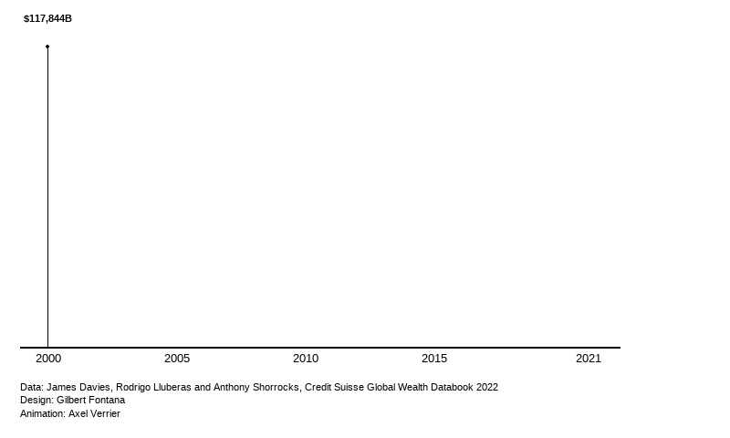
Let’s start by installing the required dependencies.
Since there is no API, we define a function to retrieve any author’s ID.
get_author_id <- function(name){
if(typeof(name)!="character"){stop("Please enter a character vector")}
url <- paste0("https://scholar.google.com/citations?view_op=search_authors&mauthors=", paste(gsub(" ", "+", trimws(name)), sep="+"))
id <- rvest::read_html(url) %>%
rvest::html_elements(".gs_ai_name a") %>%
rvest::html_attr("href") %>%
stringr::str_extract("user=([^&]+)") %>%
str_replace("user=", "") %>%
first()
if(rlang::is_empty(id) | is.na(id)){
stop("No author was found")
}else{
return(id)
}
}Now we define a function to scrap 20 of the papers from this author.
get_author_papers <- function(name, by=c("recent", "citations")){
url <- paste0("https://scholar.google.com/citations?hl=fr&user=", get_author_id(name), "&view_op=list_works")
if(by=="recent"){url <- paste0(url, "&sortby=pubdate")}
title <- url %>%
rvest::read_html() %>%
rvest::html_elements(".gsc_a_at") %>%
rvest::html_text() %>%
tibble::as_tibble() %>%
rename(title=value)
year <- url %>%
rvest::read_html() %>%
rvest::html_elements(".gsc_a_hc") %>%
rvest::html_text() %>%
tibble::as_tibble() %>%
rename(year=value)
surname <- str_split(name, " ") %>% unlist()
surname <- surname[[length(surname)]]
coauth <-
url %>%
rvest::read_html() %>%
rvest::html_elements(".gsc_a_at+ .gs_gray") %>%
rvest::html_text() %>%
str_replace(paste0("(?i)(?<=,|^)[^,]*", surname, "[^,]*(?=,|$)"), "") %>%
str_replace("^[,\\s]+|[,\\s]+$", "") %>%
str_replace(",,", ",") %>%
tibble::as_tibble() %>%
rename(coauth=value)
return(tibble(title, year, coauth))
}A small drawback of my method to get rid of the author’s name among coauthors is that if two persons with the same last name publish a paper together (eg: a couple), then one of them will be removed (first occurrence of the last name). Although this can be a problem, it is unlikely to happen very often, and I have no other solution to offer as I cannot perform matching on the whole author’s name, as first and middle names are usually abbreviated in different ways.
Let’s display those information for Daron Acemoglu.
Hopefully one day I’ll learn how to interact with JS components to load more than 20 papers.
I’ve faced so many problems using rvest to try to scrap data from Wikipedia. For most pages, using the Selector gadget doesn’t work; I’ve relied on the developer tools in Chrome and using xpath instead of css selectors.
I start by retrieving data on CO2 emissions on Wikipedia.
co2_change <- rvest::read_html("https://en.wikipedia.org/wiki/List_of_countries_by_carbon_dioxide_emissions") %>%
html_node(xpath='/html/body/div[2]/div/div[3]/main/div[3]/div[3]/div[1]/table') %>%
html_table() %>%
select(1,9) %>%
rename(country=1, co2=2) %>%
mutate(co2=as.numeric(gsub(",|%", "", co2))/100) %>%
filter(!row_number() %in% c(1,210:213)) %>%
mutate(co2_index=log(co2))
world_sf <- rnaturalearth::ne_download(returnclass = "sf")We now create a map out of it.
co2_change %>%
dplyr::mutate(iso3c = countrycode::countrycode(country, "country.name", "iso3c")) |>
dplyr::right_join(world_sf |>
dplyr::select(ISO_A3_EH, geometry),
by = c("iso3c" = "ISO_A3_EH")) |>
ggplot() +
geom_sf(
aes(fill = co2_index,
geometry = geometry),
alpha = 0.5) +
ggplot2::scale_fill_gradientn(
colours=c("darkgreen", "lightgreen", "yellow", "darkred"),
values = scales::rescale(c(-2,0,0.001, 2.5)),
na.value = "white",
limits = c(-2, 2.5),
oob = scales::oob_squish,
breaks=c(-2,0,2.5),
labels=c("-2 (decrease)", "0 (equal)", "2.5 (increase)"),
name="Evolution (in log)"
)+
labs(
title = "CO2 Emissions evolution since 1990",
caption = "Source: Crippa et al (2023). GHG emissions of all world countries – 2023. Luxembourg: Publications Office of the European Union. Retrieved from Wikipedia."
) +
ggthemes::theme_map()---
title: "OECD workshop on R"
description: "R4DEV workshop from my internship at OECD"
date: 2024-03-14
categories: [R, course]
execute:
eval: false
---
This is the results of an OECD workshop on R called [**R4DEV**](https://r4dev.netlify.app/) created and taught by Nelson Amaya. It took place from March to June 2024. During this workshop, I learned how to use R for text analysis, data visualisation (plots, animated graphs and maps), web scrapping, shiny apps and quarto publishing.
## Plotting data
### Spotify song analysis
Let's first load the packages necessary for the analysis.
```{r message=FALSE, warning=FALSE}
# Charging dependencies
library(tidyverse)
library(spotifyr)
library(ggridges)
library(RColorBrewer)
library(MetBrewer)
library(plotly)
library(htmltools)
library(ggiraph)
```
I define my token for accessing the Spotify API (hidden) and create the function for retrieving the artist ID.
```{r include = FALSE}
# Set Client ID and Client Secret
Sys.setenv(SPOTIFY_CLIENT_ID = "36a69de60d6b42e284820e2d7bbb13e3")
Sys.setenv(SPOTIFY_CLIENT_SECRET = "ecfb19e1c69b4e6fb7c286c7f922640d")
spotify_access_token <- get_spotify_access_token()
```
```{r}
spotify_id <- function(artist_name) {
spotifyr::search_spotify(print(artist_name), type = "artist") |>
dplyr::select(id) |>
dplyr::slice(1) |>
as.character()
}
```
Then I define some of my favorite artists in a tibble.
```{r results='hide'}
favorites <- tribble(
~artist,
"Damso",
"Dooz Kawa",
"Connor Price",
"Twenty One Pilots",
) |>
dplyr::rowwise() |>
dplyr::mutate(artist_id = spotify_id(artist))
#save in list
favorites_music <- list()
```
Now I retrieve the data using the Spotify API.
```{r results='hide'}
for(i in favorites$artist_id) {
favorites_music[[i]] <- spotifyr::get_artist_audio_features(artist = print(i),
include_groups = "album",
authorization = spotify_access_token)
}
```
Finally here is a graph of the 4 artists.
```{r}
spotify_covers_gg <- favorites_music %>%
purrr::map_df(bind_rows) %>%
dplyr::left_join(favorites, by="artist_id") |>
dplyr::mutate(cover = map(album_images, ~.x[[2]][[2]])) |>
ggplot(aes(y=energy,x=valence,color=artist_name))+
geom_point_interactive(
aes(shape = artist_name,
tooltip = paste0(
"<div style='display: flex; align-items: center;'>",
"<img src='", cover, "' style='width:100px; height:auto; margin-right: 10px;'>",
"<div>",
"<b>Artist:</b> ", artist_name, "<br>",
"<b>Song:</b> ", track_name, "<br>",
"<b>Album:</b> ", album_name,
"</div>",
"</div>"
)),
position = "jitter")+
geom_hline(yintercept = 0.5)+
geom_vline(xintercept = 0.5)+
annotate("text", x = 0.2, y = 1, label = "Turbulent/Angry")+
annotate("text", x = 0.8, y = 1, label = "Happy/Joyful")+
annotate("text", x = 0.2, y = 0.1, label = "Sad/Depressing")+
annotate("text", x = 0.8, y = 0.1, label = "Chill/Peaceful")+
labs(title = "Energy vs. Valence by artist",
caption = "Source: Spotify data")+
MetBrewer::scale_color_met_d(name = "Ingres")+
scale_shape_manual(values = c(1:8))+
theme_classic()+
theme(legend.position = "top",
legend.title = element_blank())
girafe(ggobj = spotify_covers_gg)
```
Most of the music produced by the four artists I chose is high-energy music. Dooz Kawa musics are rather happy and joyful (not so sure about that...) whereas Twenty One Pilots and Damso musics are more turbulent. Connor Price's songs are equally distributed between angry and joyful, which seems correct. Also, apparently, I don't listen to low energy music unless it's depressing...
### CO2 emissions (OWID)
Now let's build a nice graph from OWID data. Let's focus on CO2 emissions.
```{r message=FALSE, warning=FALSE}
library(ggplot2)
library(dplyr)
library(plotly)
library(viridis)
library(hrbrthemes)
```
I first download the dataset directly from Github.
```{r message=FALSE, warning=FALSE}
co2data <- readr::read_csv("https://raw.githubusercontent.com/owid/co2-data/master/owid-co2-data.csv") |>
janitor::clean_names() |>
dplyr::mutate(continent = countrycode::countrycode(sourcevar = country, origin = "country.name", destination = "continent"))
```
I then build a nice bubble chart, made interactive with plotly.
```{r}
p <- co2data |>
filter(year=="2018") |>
dplyr::select(country, population, gdp, co2_per_capita, co2, continent) |>
dplyr::filter(!is.na(continent), !is.na(gdp)) |>
mutate(gdppc=round(gdp/population, 0)) |>
arrange(desc(co2_per_capita)) |>
mutate(country = factor(country, country)) |>
mutate(text = paste("Country: ", country, "\nCO2 per capita (t): ", co2_per_capita, "\nPopulation (M): ", round(population/1000000,2), "\nGdp per capita ($) : ", gdppc, sep="")) |>
ggplot(aes(x=gdppc, y=co2_per_capita, size = population, color = continent, text=text)) +
geom_point(alpha=0.7) +
scale_size(range = c(1, 20), name="CO2 per capita (t)") +
scale_x_log10(breaks = c(1000, 10000, 100000),
labels = c("1 000", "10 000", "100 000"))+
scale_color_viridis(discrete=TRUE, guide=FALSE) +
theme_ipsum() +
theme(legend.position="none")+
labs(title = "Chart of country population size by CO2 emissions and GDP",
x= "Annual GDP ($/per capita, in log)",
y= "CO2 emissions (tons of CO2/per capita")
pp <- ggplotly(p, tooltip="text") |>
layout(annotations =
list(x = 1, y = -0.2,
text = "Source: OWID Data",
showarrow = F,
xref='paper',
yref='paper')
)
pp
```
::: callout-warning
I must say this graph is pretty useless and it doesn't show much information, but the keyword to remember here is "pretty".
:::
### Interactive charts with ggiraph
Let's create two side-by-side visualisations using `ggiraph`. We use the dataset `epa2021` from the package `openintro`.
```{r message=FALSE, warning=FALSE}
library(ggplot2)
library(dplyr)
library(hrbrthemes)
library(viridis)
library(patchwork)
library(openintro)
```
First we clean and arrange the data.
```{r warning=FALSE}
data(epa2021)
data <- epa2021 |>
mutate(luxury=mfr_name %in% c("Rolls-Royce", "Porsche", "Maserati", "aston martin", "Ferrari", "Lotus", "Jaguar Land Rover L")) |>
mutate(luxury=factor(luxury, levels = c(TRUE, FALSE), labels=c("High-end", "Not high-end"))) |>
group_by(mfr_name) |>
mutate(avg_city_mpg = mean(city_mpg, na.rm=TRUE),
avg_hwy_mpg = mean(hwy_mpg, na.rm=TRUE)) |>
ungroup()
```
Then we create our first plot.
```{r warning=FALSE}
p1 <- data |>
ggplot() +
geom_segment_interactive(aes(x=forcats::fct_reorder2(mfr_name, desc(as.integer((luxury))), avg_city_mpg), xend=mfr_name, y=avg_city_mpg, yend=avg_hwy_mpg, tooltip=luxury, data_id=luxury), color="grey", size=1.3)+
geom_point( aes(x=mfr_name, y=avg_city_mpg), color=rgb(0.2,0.7,0.1,0.5), size=3 ) +
geom_point( aes(x=mfr_name, y=avg_hwy_mpg), color="lightblue", size=3 ) +
coord_flip()+
theme_ipsum() +
theme(
axis.line = element_line(colour = "grey50"),
panel.grid.minor = element_blank(),
panel.grid.major.y = element_line(linetype = "dashed"),
plot.background = element_rect(fill = "#fbf9f4", color = "#fbf9f4"),
legend.position = "bottom"
) +
labs(title = "Average city/highway mileage",
y= "Average mileage", x=NULL) +
scale_color_manual(values = c("lightblue", rgb(0.2,0.7,0.1,0.5)),
labels = c("City Mileage", "Highway Mileage"))
```
Then our second plot.
```{r warning=FALSE}
p2 <- data |>
ggplot( aes(x=forcats::fct_reorder(luxury, desc(as.integer((luxury)))), y=no_cylinders, fill=luxury)) +
geom_violin_interactive(aes(data_id=luxury, tooltip=luxury)) +
geom_jitter(color="black", size=0.4, alpha=0.9) +
scale_fill_viridis(discrete = TRUE, alpha=0.6, option = "G") +
theme_ipsum() +
coord_flip()+
theme(
axis.line = element_line(colour = "grey50"),
panel.grid.minor = element_blank(),
panel.grid.major.y = element_line(linetype = "dashed"),
legend.position = "none"
) +
labs(title = "Number of cylinders",
y= "Number of cylinders", x=NULL)
```
Finally we combine them using `ggiraph`.
```{r}
ggiraph::girafe(
ggobj = p1 + p2 +
plot_annotation(
title = 'Car\'s characteristics by manufacturer and luxury type',
caption = 'Source: EPA (2021)',
theme = theme(plot.title = element_text(size = 25),
plot.background = element_rect(fill = "#fbf9f4", color = "#fbf9f4"))
),
options = list(
opts_hover_inv(css = "opacity:0.1;")
),
width_svg = 10,
height_svg = 6
)
```
::: callout-warning
I don't understand why the geom_point legend set in the first graph by `scale_colour_manual()` doesn't work...
:::
## Text and sentiment analysis
### Word frequency
Let's first load the packages necessary for the analysis.
```{r message=FALSE, warning=FALSE}
#| label: Dependencies
library(gutenbergr)
library(tidyverse)
library(tidytext)
library(stopwords)
library(hunspell)
library(SnowballC)
library(ggpattern)
library(ggwordcloud)
library(RColorBrewer)
library(textdata)
```
```{r message=FALSE, warning=FALSE}
#| label: Cleaning
wizard_of_oz <- gutenberg_download(54) |> select(text)
oz_df <- wizard_of_oz |>
stringr::str_squish() |>
tibble::as_tibble() |>
tidytext::unnest_tokens(input = "value",
output = "word",
token = "words",
to_lower=TRUE) |>
dplyr::anti_join(stopwords::stopwords(language = "en") |>
as_tibble(),
by=c("word"="value")) |>
dplyr::mutate(stem = SnowballC::wordStem(word))
```
```{r}
#| label: Bar graph
bar_graph <- oz_df |>
dplyr::group_by(word) |>
dplyr::mutate(word_count = n()) |>
dplyr::ungroup() |>
dplyr::arrange(desc(word_count)) |>
dplyr::distinct(word, .keep_all = TRUE) |>
dplyr::slice_max(order_by = word_count, n=30) |>
ggplot(aes(x=word |> reorder(word_count),y=word_count, fill=word_count))+
ggpattern::geom_col_pattern(
aes(pattern_fill = word_count),
pattern = 'none',
fill="seagreen4",
show.legend = FALSE)+
geom_label(aes(label=word_count), size = 3, color="white",hjust=-0.5)+
coord_flip()+
ylim(c(0,2500))+
labs(x=NULL,y=NULL,
title="Words in The Jungle Book",
subtitle = "30 most frequent words.")
bar_graph
```
Let's turn it into a wordcloud.
```{r}
#| label: Wordcloud
wordcloud <- oz_df |>
dplyr::group_by(word) |>
dplyr::summarise(word_count = n()) |>
dplyr::distinct(word, .keep_all = TRUE) |>
dplyr::slice_max(order_by=word_count, n = 100) |>
ggplot()+
ggwordcloud::geom_text_wordcloud(aes(label = word, size = word_count, color=word_count)) +
scale_size_area(max_size = 17) +
scale_color_distiller(palette="RdYlGn", direction=-1)+
theme_minimal()
wordcloud
```
### Sentiment analysis
::: callout-warning
The dataset bing from `tidytext` classifies the words envious, enviousness and enviously twice: once as positive, once as negative... Error ?
:::
```{r message=FALSE, warning=FALSE}
sentiment1 <- oz_df |>
select(-stem) |>
dplyr::left_join(get_sentiments("bing"),
by=c("word")) |>
dplyr::filter(!is.na(sentiment)) |>
dplyr::group_by(sentiment) |>
dplyr::summarise(sentiment_count = n()) |>
ggplot(aes(x=sentiment,y=sentiment_count,fill=sentiment))+
geom_col(show.legend = FALSE)+
coord_flip()+
labs(x=NULL,y="Word count",
title = "The Wonderful Wizard of Oz, of L. Frank Baum",
subtitle = "Text analysis using Bing")+
scale_fill_manual(values = c("#FFD0EC","#1F2544"))
sentiment1
```
```{r message=FALSE, warning=FALSE}
nrc <- tidytext::get_sentiments("nrc")
sentiment2 <- oz_df |>
dplyr::left_join(nrc,
by=c("word"="word"), multiple="all") |>
dplyr::filter(!is.na(sentiment)) |>
dplyr::group_by(sentiment) |>
dplyr::summarize(sentiment_count = n()) |>
ggplot(aes(x=reorder(sentiment, sentiment_count), y=sentiment_count,fill=sentiment))+
geom_col()+
coord_flip()+
labs(x=NULL,y="Word count",
title = "Infinite Jest by David Foster Wallace",
subtitle = "Text analysis using NRC lexicon")+
theme(legend.position = "none")+
scale_fill_manual(values=c(
"positive"="forestgreen",
"negative"="orangered",
"trust"="royalblue",
"anticipation"="gold",
"fear"="red",
"sadness"="purple",
"joy"="green",
"anger"="black",
"disgust"="brown",
"surprise"="cyan")
)
```
::: callout-warning
Why can't I use `tidytext::get_sentiment("nrc")` inside the left_join ?
:::
### Sentiment analysis of Pride and Prejudice
Let's begin by loading the data which is available in a R package.
```{r message=FALSE, warning=FALSE}
#| label: Import
library("janeaustenr")
library("viridis")
pride <- janeaustenr::prideprejudice
```
Then we clean the data by tokenizing it and removing stop words.
```{r}
#| label: Text cleaning
pride_df <- pride |>
stringr::str_squish() |>
tibble::as_tibble() |>
tidytext::unnest_tokens(input = "value",
output = "text",
token = "words",
to_lower = TRUE) |>
anti_join(stopwords::stopwords(language = "en") |>
as_tibble(), by=c("text"="value"))
```
We then make a nice use of a loop to get every different type of sentiment analysis available from the `tidytext::get_sentiment()` function.
```{r warning=FALSE}
#| label: Loop for SA
for (i in c("bing", "loughran", "nrc")){
pride_df |>
left_join(tidytext::get_sentiments(i), by=c("text"="word"), multiple="all") %>%
filter(!is.na(sentiment)) |>
group_by(sentiment) |>
summarize(sentiment_count = n()) %>%
{assign(paste0("sentiment_", i), ., envir = .GlobalEnv)}
}
```
::: callout-caution
This is a nice example of one way that the two pipes differ. Using the base R pipe ( \|\> ) doesn't allow for the use of brackets ( {} ), whereas `magrittr`'s pipe does ( %\>% ).
:::
AFINN is a bit different, variables names are different too, so we do not include it into the loop.
```{r warning=FALSE}
#| label: AFINN
sentiment_afinn <- pride_df |>
left_join(tidytext::get_sentiments("afinn"), by=c("text"="word"), multiple="all") %>%
filter(!is.na(value)) |>
group_by(value) |>
dplyr::mutate(n = n(),
p = n/sum(n),
c = case_when(value<0 ~ "Negative",
value==0 ~ "Neutral",
value>0 ~ "Positive") |>
factor())
```
#### Custom theme
Let's make our own theme so that the graphs are easier to customize.
```{r}
#| label: Create theme
theme_axel <- function () {
theme(
axis.line = element_blank(),
axis.ticks = element_blank(),
panel.grid.major.x = element_line(colour="black", linetype = "dashed"),
panel.background = element_rect(fill = "#fbf9f4", color = "#fbf9f4"),
panel.border = element_rect(linetype = 1, fill=NA),
plot.background = element_rect(fill = "#fbf9f4", color = "#fbf9f4")
)
}
```
#### Bing
```{r}
#| label: Bing
plot_bing <- sentiment_bing %>%
ggplot(aes(x=sentiment,y=sentiment_count,fill=sentiment))+
geom_col(show.legend = FALSE)+
coord_flip()+
labs(x=NULL,y="Word count",
title = "Pride and Prejudice, Jane Austen",
subtitle = "Text analysis using Bing")+
scale_fill_viridis(discrete = TRUE, option="turbo") +
theme_axel()
plot_bing
```
#### NRC
```{r}
#| label: NRC
plot_nrc <- sentiment_nrc %>%
ggplot(aes(x=sentiment,y=sentiment_count,fill=sentiment))+
geom_col(show.legend = FALSE)+
coord_flip()+
labs(x=NULL,y="Word count",
title = "Pride and Prejudice, Jane Austen",
subtitle = "Text analysis using NRC")+
scale_fill_viridis(discrete = TRUE, option="turbo") +
theme_axel()
plot_nrc
```
#### Loughran
```{r}
plot_loughran <- sentiment_loughran %>%
ggplot(aes(x=sentiment,y=sentiment_count,fill=sentiment))+
geom_col(show.legend = FALSE)+
coord_flip()+
labs(x=NULL,y="Word count",
title = "Pride and Prejudice, Jane Austen",
subtitle = "Text analysis using Loughran")+
scale_fill_viridis(discrete = TRUE, option="turbo") +
theme_axel()
plot_loughran
```
#### AFINN
```{r}
plot_afinn <- sentiment_afinn %>%
ggplot(aes(x=value,y=n,color=c))+
geom_col(show.legend = FALSE)+
geom_vline(xintercept = 0)+
scale_x_continuous(breaks=seq(from=-5,to=5,by=1))+
annotate("text",x=-3.5,y=4e+06, label ="Negative", color = "#30123BFF")+
annotate("text",x=0.1,y=4e+06, label ="Positive", color = "#7A0403FF")+
labs(x=NULL,y="Word frequency",
title = "Pride and Prejudice, Jane Austen",
subtitle = "Text analysis using Afinn")+
scale_color_viridis(discrete = TRUE, option="turbo") +
theme_axel()
plot_afinn
```
#### Comparison
| Sentiment lexicon | Pros | Cons |
|:------------------|:----------------------------------------------------------|-----:|
| Bing | Easy to understand | Limited information |
| NRC | Extensive information (sentiments AND emotions) | to be found ? |
| Loughran | New insights and nuances on what is expressed in the text | Created for use with financial documents, maybe not the most appropriate lexicon for analyzing books |
| AFINN | Allows intensity analysis | Limited information |
: Comparison of sentiment lexicons available in tidytext.
### Utility functions
A reusable function to clean text from `gutenbergr`:
```{r}
#| code-fold: false
get_text <- function(id_gutenberg=54, lang="en") {
gutenberg_download(id_gutenberg) |>
select(text) |>
stringr::str_squish() |>
tibble::as_tibble() |>
tidytext::unnest_tokens(input = "value",
output = "word",
token = "words",
to_lower=TRUE) |>
dplyr::anti_join(stopwords::stopwords(language = lang) |>
as_tibble(),
by=c("word"="value"))
}
```
A reusable function performing sentiment analysis for any book from `gutenbergr`:
```{r}
#| code-fold: false
sa <- function(book, lexicon=c("nrc", "bing", "loughran")){
book %>%
left_join(tidytext::get_sentiments(lexicon), by=c("word"="word"), multiple="all") %>%
filter(!is.na(sentiment)) |>
group_by(sentiment) |>
summarize(sentiment_count = n()) %>%
ggplot(aes(x=sentiment,y=sentiment_count,fill=sentiment))+
geom_col(show.legend = FALSE)+
coord_flip()+
labs(x=NULL,y="Word count",
subtitle = paste0("Text analysis using ", lexicon) )+
scale_fill_viridis(discrete = TRUE, option="turbo") +
theme_axel()
}
```
## Animating graphs
In this section, I reproduce a graph but making an animation out of it using the package `gganimate`.
The graph I use is from [Gilbert Fontana](https://twitter.com/GilbertFontana/status/1681734005668888601) whose code is available [here](https://r-graph-gallery.com/web-stacked-area-chart-inline-labels.html).
I made some minor adjustment for it to work with gganimate, and added the animation part.
First, let's load the packages.
```{r eval=FALSE}
#| label: anim-loading-packages
library(tidyverse)
library(ggtext)
library(openxlsx)
library(gganimate)
```
Then I load the data.
```{r eval=FALSE}
#| label: Loading the data
data = openxlsx::read.xlsx("https://github.com/holtzy/R-graph-gallery/raw/master/DATA/wealth_data.xlsx",sheet=1)
```
Some minor preparation details.
```{r eval=FALSE}
#color palette
pal=c("#003f5c",
"#2f4b7c",
"#665191",
"#a05195",
"#d45087",
"#f95d6a",
"#ff7c43",
"#ffa600")
# Stacking order
order <- c("United States", "China", "Japan", "Germany", "United Kingdom", "France", "India", "Other")
theme_set(theme_minimal(base_size = 3))
```
And finally, the plot, in which I incorporated a gganimate element: `transition_reveal()`.
```{r eval=FALSE}
#| label: the plot
plot <- data %>%
mutate(country = factor(country, levels=order)) %>%
ggplot(aes(year, total_wealth, fill = country, label = country, color = country)) +
geom_area() +
gganimate::transition_reveal(after_stat(x))+
view_follow(fixed_x = TRUE) +
annotate("text", x = 2000, y = 100000,
label = "Aggregated\nHousehold\nWealth",
hjust=0, vjust=-1.9, size=12, lineheight=.9,
fontface="bold", color="black") +
annotate("text", x = 2021.2, y = 370000, label = "USA $145,793B",
hjust=0, size=3, lineheight=.8, fontface="bold", color=pal[1]) +
annotate("text", x = 2021.2, y = 270000, label = "China $85,107B",
hjust=0, size=3, lineheight=.8, fontface="bold", color=pal[2]) +
annotate("text", x = 2021.2, y = 225000, label = "Japan $25,692B",
hjust=0, size=3, lineheight=.8, fontface="bold", color=pal[3]) +
annotate("text", x = 2021.2, y = 200000, label = "Germany $17,489B",
hjust=0, size=3, lineheight=.8, fontface="bold", color=pal[4]) +
annotate("text", x = 2021.2, y = 180000, label = "UK $16,261B",
hjust=0, size=3, lineheight=.8, fontface="bold", color=pal[5]) +
annotate("text", x = 2021.2, y = 166000, label = "France $16,159B",
hjust=0, size=3, lineheight=.8, fontface="bold", color=pal[6]) +
annotate("text", x = 2021.2, y = 150000, label = "India $14,225B",
hjust=0, size=3, lineheight=.8, fontface="bold", color=pal[7]) +
annotate("text", x = 2021.2, y = 80000, label = "Rest of the world\n$142,841B",
hjust=0, size=3, lineheight=1.5, fontface="bold", color=pal[8]) +
geom_segment(aes(x = 2000, y = 0, xend = 2000, yend = 117426+20000), color="black") +
geom_point(aes(x = 2000, y = 117426+20000), color="black") +
annotate("text", x = 2000, y = 117426+33000, label = "$117,844B",
hjust=0.5, size=3, lineheight=.8, fontface="bold", color="black") +
geom_segment(aes(x = 2005, y = 0, xend = 2005, yend = 181731+20000), color="black") +
geom_point(aes(x = 2005, y = 181731+20000), color="black") +
annotate("text", x = 2005, y = 181731+33000, label = "$182,350B",
hjust=0.5, size=3, lineheight=.8, fontface="bold", color="black") +
geom_segment(aes(x = 2010, y = 0, xend = 2010, yend = 250932+20000), color="black") +
geom_point(aes(x = 2010, y = 250932+20000), color="black") +
annotate("text", x = 2010, y = 250932+33000, label = "$251,885B",
hjust=0.5, size=3, lineheight=.8, fontface="bold", color="black") +
geom_segment(aes(x = 2015, y = 0, xend = 2015, yend = 296203+25000), color="black") +
geom_point(aes(x = 2015, y = 296203+25000), color="black") +
annotate("text", x = 2015, y = 296203+38000, label = "$297,698B",
hjust=0.5, size=3, lineheight=.8, fontface="bold", color="black") +
geom_segment(aes(x = 2021, y = 0, xend = 2021, yend = 461370+50000), color="black") +
geom_point(aes(x = 2021, y = 461370+50000), color="black") +
annotate("text", x = 2021, y = 461370+50000, label = "$463,567B",
hjust=1.1, size=3, lineheight=.8, fontface="bold", color="black") +
scale_fill_manual(values=pal) +
scale_color_manual(values=pal) +
scale_x_continuous(breaks=c(2000,2005,2010,2015,2021),
labels = c("2000","2005","2010","2015","2021")) +
scale_y_continuous(expand = c(0,0)) +
coord_cartesian(clip = "off") +
xlab("") + ylab("") +
labs(caption = "Data: James Davies, Rodrigo Lluberas and Anthony Shorrocks, Credit Suisse Global Wealth Databook 2022
Design: Gilbert Fontana
Animation: Axel Verrier") +
theme(
axis.line.x = element_line(linewidth = .75),
panel.grid = element_blank(),
axis.text.y = element_blank(),
axis.text.x = element_text(color="black", size=10, margin = margin(5,0,0,0)),
plot.margin = margin(20,120,20,20),
legend.position = "none",
plot.caption = element_text(hjust=0, margin=margin(50,0,0,0), size = 8, lineheight = 1.5)
)
```
Finally, the plot is transformed into a gif and saved.
```{r eval=FALSE}
animate(plot,
fps = 10,
duration = 20,
width=800,
end_pause = 80,
renderer = gifski_renderer())
anim_save(paste0(getwd(), "/posts/2024-03-14-oecd-r-workshop/wealth.gif"),
animation = last_animation())
```

## Web scrapping
### Scraping Google Scholar
Let's start by installing the required dependencies.
```{r message=FALSE, warning=FALSE}
#| label: scrap-loading-packages
library(tidyverse)
library(rvest)
library(rlang)
library(reactable)
```
Since there is no API, we define a function to retrieve any author's ID.
```{r}
#| label: Creating function to retrieve author's id
#| code-fold: show
get_author_id <- function(name){
if(typeof(name)!="character"){stop("Please enter a character vector")}
url <- paste0("https://scholar.google.com/citations?view_op=search_authors&mauthors=", paste(gsub(" ", "+", trimws(name)), sep="+"))
id <- rvest::read_html(url) %>%
rvest::html_elements(".gs_ai_name a") %>%
rvest::html_attr("href") %>%
stringr::str_extract("user=([^&]+)") %>%
str_replace("user=", "") %>%
first()
if(rlang::is_empty(id) | is.na(id)){
stop("No author was found")
}else{
return(id)
}
}
```
Now we define a function to scrap 20 of the papers from this author.
```{r}
#| label: Function to retrieve the author's papers
#| code-fold: show
get_author_papers <- function(name, by=c("recent", "citations")){
url <- paste0("https://scholar.google.com/citations?hl=fr&user=", get_author_id(name), "&view_op=list_works")
if(by=="recent"){url <- paste0(url, "&sortby=pubdate")}
title <- url %>%
rvest::read_html() %>%
rvest::html_elements(".gsc_a_at") %>%
rvest::html_text() %>%
tibble::as_tibble() %>%
rename(title=value)
year <- url %>%
rvest::read_html() %>%
rvest::html_elements(".gsc_a_hc") %>%
rvest::html_text() %>%
tibble::as_tibble() %>%
rename(year=value)
surname <- str_split(name, " ") %>% unlist()
surname <- surname[[length(surname)]]
coauth <-
url %>%
rvest::read_html() %>%
rvest::html_elements(".gsc_a_at+ .gs_gray") %>%
rvest::html_text() %>%
str_replace(paste0("(?i)(?<=,|^)[^,]*", surname, "[^,]*(?=,|$)"), "") %>%
str_replace("^[,\\s]+|[,\\s]+$", "") %>%
str_replace(",,", ",") %>%
tibble::as_tibble() %>%
rename(coauth=value)
return(tibble(title, year, coauth))
}
```
::: {.callout-caution collapse="true"}
A small drawback of my method to get rid of the author's name among coauthors is that if two persons with the same last name publish a paper together (eg: a couple), then one of them will be removed (first occurrence of the last name). Although this can be a problem, it is unlikely to happen very often, and I have no other solution to offer as I cannot perform matching on the whole author's name, as first and middle names are usually abbreviated in different ways.
:::
Let's display those information for Daron Acemoglu.
```{r}
#| label: Apply for Daron Acemoglu
get_author_papers("Daron Acemoglu", by="recent") %>%
reactable(
searchable = TRUE,
striped = TRUE,
resizable = TRUE
)
```
```{r include=FALSE}
status <- rvest::read_html("https://r4dev.netlify.app/sessions_workshop/06-scrap/06-scrap") %>%
rvest::html_elements("#part-ii-beyond-static-websites p") %>%
rvest::html_text()
```
::: callout-note
## What's next
Hopefully one day I'll learn how to interact with JS components to load more than 20 papers.
:::
### Scraping Wikipedia
I've faced so many problems using rvest to try to scrap data from Wikipedia. For most pages, using the Selector gadget doesn't work; I've relied on the developer tools in Chrome and using xpath instead of css selectors.
```{r include=FALSE}
#| label: Loading dependencies
library(tidyverse)
library(rvest)
library(sf)
library(rnaturalearth)
library(ggthemes)
library(countrycode)
```
I start by retrieving data on CO2 emissions on Wikipedia.
```{r message=FALSE}
#| label: Retrieve data
co2_change <- rvest::read_html("https://en.wikipedia.org/wiki/List_of_countries_by_carbon_dioxide_emissions") %>%
html_node(xpath='/html/body/div[2]/div/div[3]/main/div[3]/div[3]/div[1]/table') %>%
html_table() %>%
select(1,9) %>%
rename(country=1, co2=2) %>%
mutate(co2=as.numeric(gsub(",|%", "", co2))/100) %>%
filter(!row_number() %in% c(1,210:213)) %>%
mutate(co2_index=log(co2))
world_sf <- rnaturalearth::ne_download(returnclass = "sf")
```
We now create a map out of it.
```{r warning=FALSE}
#| label: Create map
co2_change %>%
dplyr::mutate(iso3c = countrycode::countrycode(country, "country.name", "iso3c")) |>
dplyr::right_join(world_sf |>
dplyr::select(ISO_A3_EH, geometry),
by = c("iso3c" = "ISO_A3_EH")) |>
ggplot() +
geom_sf(
aes(fill = co2_index,
geometry = geometry),
alpha = 0.5) +
ggplot2::scale_fill_gradientn(
colours=c("darkgreen", "lightgreen", "yellow", "darkred"),
values = scales::rescale(c(-2,0,0.001, 2.5)),
na.value = "white",
limits = c(-2, 2.5),
oob = scales::oob_squish,
breaks=c(-2,0,2.5),
labels=c("-2 (decrease)", "0 (equal)", "2.5 (increase)"),
name="Evolution (in log)"
)+
labs(
title = "CO2 Emissions evolution since 1990",
caption = "Source: Crippa et al (2023). GHG emissions of all world countries – 2023. Luxembourg: Publications Office of the European Union. Retrieved from Wikipedia."
) +
ggthemes::theme_map()
```